
Wikipedia talk:WikiProject Mathematics/Graphics
Resources[edit]
Some fun reading for your free time:
- Bill Casselman has written a book about Mathematical Illustrations that can be downloaded free. At the bottom of that page is also a link to an AMS article (as PDF).
- Although out of print, another source of inspiration is topologist George K. Francis' A Topological Picturebook (ISBN 978-0-387-96426-3).
- Mathematician Ralph Abraham at UCSC produced a 4-volume series of books packed full of images, Dynamics, the Geometry of Behavior (ISBN 978-0-942344-24-0). Available on CD from Aerial Press.
- The great geometer David Hilbert, along with Stephan Cohn-Vossen, produced the must-have Geometry and the Imagination (ISBN 978-0-8218-1998-2), so good it was reprinted by the American Mathematical Society.
- More specialized is William S. Cleveland's The Elements of Graphing Data (ISBN 978-0-534-17352-4), which is an excellent guide for its purpose.
- It may seem irrelevant, but a delightful non-mathematical source is Ollie Johnston and Frank Thomas, The Illusion of Life: Disney Animation (ISBN 978-0-7868-6070-8).
There are others, but these are all worth studying. Enjoy. --KSmrqT 10:43, 14 June 2006 (UTC)
- I'd love to see Abraham's images in WP. e.g. the current image in heteroclinic sucks. linas 22:48, 22 June 2006 (UTC)
- Wow, thanks for the link to the downloadable book! I will definitely read it! SharkD (talk) 08:07, 18 August 2008 (UTC)
Just found an essential Wikipedia page:
It also has some useful links to other Wikipedia info. --KSmrqT 00:52, 12 August 2006 (UTC)
Also helpful is the Wikipedia:Picture tutorial. One item worth remembering is the default thumbnail size, which is presently 180 pixels wide. It's a good idea to make an image large enough to print cleanly, but it's also good to make it legible — or at least meaningful — at the thumbnail size. --KSmrqT 18:58, 22 March 2007 (UTC)
Constructions[edit]
(see Compass and straightedge)
I'm definitely not an expert on graphics, unlike Jonathan48, as can probably be seen from my rather limited uploads. However, I think that, even as an encyclopedia article rather than a book, it would be good to address the basics in a way suitable for someone with no prior knowledge. That would involve explaining the elementary constructions from which all others are derived (a noticeable omission at present) Each of these would ideally be illustrated by a simple diagram. It would be useful to relate these constructions to the complex arithmetic viewpoint, then show (or at least state) that combining these is enough to provide all of the operations required. The article would then be a more solid looking introduction. However, what wikipedia needs is people who do, not people who say what might be good to do! Elroch 00:58, 8 April 2006 (UTC)
- I can't quite agree with you. Sometime we do have too many sidewalk superintendents; but I'd appreciate some guidance. Don't worry about your graphics expertise; I have plenty of that. I don't have your deep mathematical background and I don't have your insight into what a non-graphics person wants to see. Consider me your pen and ink. What would you draw?
- Do you want me to re-illustrate The Elements, perhaps dynamically? Just the first few propositions? The postulates and common notions only? Let's do it this way: Name one or, perhaps, three graphics you want to see; give me a bit of a lead on what features you want to see in them.
- I'm not too clear on what you mean by relating constructions to complex arithmetic. Do you mean to say, Demonstrate constructions on the Cartesian plane? I can do that.
- I can do a fair amount, either with detailed illustrations or simple animations. Would you take a look at Pi/Unrolled? I'm sure you appreciate that I don't want to invest that level of effort in every diagram (it was probably overkill for that application); but I'll entertain requests of merit.
- Talk to me. John Reid 01:16, 8 April 2006 (UTC)
- It's my pleasure to do so :-) By the way, the illustration of Pi/Unrolled is delightful - I will watch it to relax!
- My concept is really rather a simple one. There are only a small number of one step constructions that you can do with compass and straightedge, each of would be well-illustrated by one or two diagrams. Off the top of my head, we can produce: exactly one line from two distinct points; one circle with radius the distance between two distinct points and centre a specified point; up to one new point from two lines; up to two new points from a circle and a line; and up to two points from two circles.
- Each of these last three constructions of new points can be expressed unambiguously as a formula in the points used to construct the lines and circles, viewed as complex numbers, taking account of the different cases. (Of course all this can be expressed using vector operations instead, but complex arithmetic seems easier to me, although maybe not to a reader who was not already familiar with the complex numbers). Combining these constructions in certain ways permits us to do the arithmetic operations mentioned in the article. That's about all a reader needs to know to prepare them for life as a geometer :-) Elroch 01:56, 8 April 2006 (UTC)
Hm. Well, it looks like you do want illustrations of the Postulates: "A straight line can be drawn between two points." "A circle can be drawn with any radius and center." At least, that's how I see it. Then maybe you want some illustrations of Definitions: "This is a point."
I dunno, this kind of work could go on and on. The standard, popular web version of The Elements is [1]; it's huge and detailed. Personally, I hate it because it uses Java; that makes it interactive as well as dynamic, but then I hate Java, period; I refuse to enable it in my browser. But the rest of the world doesn't seem to mind. How far do we want to duplicate this work?
Rather than try to produce a dimwit version of Elements -- crank out the definitions, the postulates, the common notions, and the first 5 postulates before burning out in a wave of massive ennui -- I'd rather we tried beforehand to isolate the most interesting, misunderstood, or controversial constructions. For instance, it might be worthwhile illustrating I.2 and .3, to show that the collapsing compass constraint is avoidable. The parallel postulate should be illustrated all 3 ways, although for obvious reasons not all dumped into Euclidean articles. I can see some value in illustrations that attempt to show the ideal nature of circle and line; but it would just be a massive, useless drag to go much further down the exhaustive road. That way lies cruft. Interested readers should be steered away from our general reference work onto specific external elucidations of Elements.
As far as "complex numbers" are concerned, I think I have to declare a bias here. I have an EE background (among others) and the complex plane has a specific, concrete meaning for me. I know you call it i, but I think of it as j, and it refers to phase lag (or lead). I certainly deal with the Cartesian plane every day, but then it's just x and y and neither is preferred over the other. But when you say complex plane, I think you mean the real numbers along the horizontal axis and the imaginary numbers along the vertical. Correct? My point being is that I doubt you can pound enough sense into my head that I can feel comfortable in that middle ground. To me, it's either a neutral x-y plane or a representation of phase in a signal.
So, I'm not sure I see the value in showing Euclid married to the complex plane. If you say, well, I want to see Euclid in Cartesian space, okay, I can certainly buy that. I think it's the kind of illustration that belongs in Analytic geometry, though. Isn't the whole point of Euclid's view of geometry that he manages to do it entirely without algebra? John Reid 10:50, 8 April 2006 (UTC)
- The value is that using this viewpoint is very enlightening about the mathematics, as the article indicates, rather like an article about finding roots of polynomials is enlightened by Galois theory. Some theorems in both areas are probably very cumbersome or impractical without using some extra tools. For example, I don't think Euclid would have possessed the language to characterise exactly which points may be constructed, but this is rather simple from the complex viewpoint. My understanding is that the article is about the area of mathematics, rather than being restricted to Euclid's viewpoint. I must confess it was only after I added the first draft of the section on constructions as complex arithmetic that I realised that most of it was covered in different language in a section written earlier (still to be merged), so I am not unique in this viewpoint. By the way, the section relating to complex arithmetic points out that if you deal with ratios, the only arbitrary choice is that of an orientation. (i.e if you take a cartesian plane and view it as the complex numbers in any way that preserves orthogonality, complex ratios are invariant except for an arbitrary choice which swaps i and -i for all the ratios).
- My response to your request for suggestions was basically just that I think the article would be enhanced by a graphic for each of the five elementary constructions mentioned above. This is the dictionary of the language of compass and straightedge geometry, in which all constructions are written. At present we mention that this exists, but don't actually specify what it is, which is less than ideal. What do you think?
- There is no need to link the constructions to complex arithmetic. I am happy to deal with this, to justify the claims already made in the article. Elroch 18:20, 8 April 2006 (UTC)

Insofar as we have a conflict of perception, I imagine it's rooted in my engineering background. I see classical construction as free from number; Euclid stands to one side and points to this line or that and argues, "These things are alike; therefore these are also alike." Logic prevails and what I like to think of as an algebra-free zone. Naturally, one can switch on algebra, introduce the Cartesian plane (with or without complex numbers); but I just don't see any of this as Euclidean.
I'm tempted to argue that all such discussion belongs in a distinct article and Compass and straightedge be restricted to purely Euclidean concepts. This is by way of analogy to the decision to move impossible constructions and forbidden techniques to their own pages.
The appeal of construction to me, and perhaps to the young learner, is that there is never any need to analyze the construction; it is a purely synthetic discipline. The calculator stays in the backpack. To get a real feel for my viewpoint, let me say in what high regard I hold Byrne (example: Euclid I.1). Byrne dispenses even with the symbolism of labeling points A, B, C, and so on.
I like to think constructions speak for themselves; no need for analyzing them by way of algebra. I'm sure there's a vast amount of such analysis but this is far over the head of the young learner.
Let me just say that if you want to impose the Cartesian plane on a few constructions, I'm willing to help out -- provided they go into a distinct article. So, moving on: Here's a demo concept of what I think you want. Tell me if I'm right or wrong. John Reid 05:51, 9 April 2006 (UTC)
- You are right in your interpretation. Your graphic is almost complete in covering each of the elementary constructions from which all others are built (the incompleteness is probably explained by me having corrected my earlier post). What we still need is a way to use the compass to draw a circle with radius the distance between two points, and centre a third point (which may, or may not be one of the first two points). As a construction, this is easy to perform, but how can it be illustrated?
- A minor point is that in the two constructions that define two points, there is sometimes only one point defined and sometimes none, but I think that is of secondary importance (it is easy to find out which occurs if we know which objects are used in the construction).
- What should and should not be in the article is an interesting issue. I believe the modern approach covered is entirely justified not because it is how one would do compass and straightedge constructions, but because it allows us to see the totality of what can be achieved using compass and straightedge constructions, which is very enlightening. I am firmly of the opinion that this eagle's eye viewpoint is highly appropriate for what has to be a short article on a big subject. For similar reasons, explaining the elementary constructions is highly appropriate, because all the constructions that we are unable to cover consist entirely of repeated use of these constructions. Elroch 16:37, 10 April 2006 (UTC)
Sorry, I think I have to disagree with construction of a circle as you describe it. That technique is forbidden in the strictest sense, because of the collapsing compass. One is not allowed to set the compass at one pair of points, then move the compass to another place on the page and draw a circle with the given radius. Mastery of I.2 and .3 shows how to get around this restriction; and indeed most constructions are vastly simplified by assuming a non-collapsing compass. But Euclid's definition of a compass is a mere circle-drawing tool; it is created anew for each circle and disappears once used.
- Thank you for enlightening me with regard to Euclid's viewpoint. In that case the construction I was describing is a multi-step construction, and your diagram is a complete list of the fundamental constructions, which greatly enhances the article. (On a pragmatic point, it is difficult to imagine a practical compass that would be adequate to draw a circle using two points, but which one could not move so as to use a third point as the centre.) Elroch 18:49, 11 April 2006 (UTC)
The issue of what does and does not belong in the article is potentially contentious. My view is that construction on the plane is a fundamental field; it should be presented in terms of its own axioms and understood initially from its own worldview. I don't welcome discussion here about Fermat primes and so forth. Algebraic analysis is chiefly useful for proving what construction cannot do; it is not useful as a generator of valid constructions. Constructions must be constructed; it is geometry. There seems, to my eye, something distinctly partaking of the digital age in the efforts to replace clear and obvious diagrams with complex arithmatic.
- To give due credit, I think it should be viewed as a modernism introduced ,probably by Gauss in the late 1700s, and developed by his successors. It would be unfair to the reader to give the impression that the subject of compass and straightedge construction was not developed after Euclid. The algebraic viewpoint can be used to show constructions exist as well as that they don't (Gauss was able to show that there existed a construction for every one of the constructible polygons, but did not provide an explicit construction even for the heptadecagon. It was Pierre Wantzel who showed that there did not exist a construction for any of the other polygons). Also I would point out that, to a mathematician, a diagram may illustrate a proof and help one understand a proof but is not a proof in itself - this must be a sequence of formal inferences. Diagrams, in themselves, can be misleading - there are many fake geometric constructions which would fool most people. Elroch 18:49, 11 April 2006 (UTC)
Of course, some of this drift may be due to the fact that previous editors have been skilled in the use of TeX while unskilled in graphic arts. I have both tools and skills appropriate to fine, concise illustration of the concepts of plane geometry; and I hope to use them to illuminate the articles in question. Whether or not I can ease algebraic analysis out to pages with which it is concerned is an open question. Certainly the analysis is notable and worthwhile; I can't object to it in the project. I'd only like to see it in its proper place.
I believe we can go well beyond the five operations diagrammed above without replicating every book of Euclid. Some middle ground should be preferred, with a few notable constructions shown and explained. For instance, I endorse the construction of the regular pentagon; though I think its current location on the page is a bit flashy; I'd rather it farther down and better explained. Construction of the regular triangle really should be done; bisection of angle and line; and of course Pythagoras should be touched upon, though briefly only at Compass and straightedge itself.
I would rather take the reader through a complete understanding of construction and proof of a simple proposition in detail, entirely from Euclid's point of view, before veering off into modern methods. As I keep reminding specialist editors: This is a general reference work, not a textbook in any field. John Reid 01:41, 11 April 2006 (UTC)
content above copied from User talk:John Reid.
I value Elroch's opinions even though I may not always agree. Let's hear from other editors as well as him and me. John Reid 14:02, 11 April 2006 (UTC)
- I am totally in support of providing the fundamental constructions and some examples of interesting constructions before the sections with a less geometric viewpoint, especially as this is historically authentic, and is probably the correct order in terms of what is required of the reader. Elroch 18:49, 11 April 2006 (UTC)
- John, I have incorporated your graphic in a new section. It occurs to me that it would be nice to have a similar graphic for my example construction (an equilateral triangle). You might well wish to add more sophisticated examples before the more algebraic sections. Elroch 18:09, 27 April 2006 (UTC)
I'm embarassed that Image:Basic-construction-demo.png now appears in articlespace. It was only intended as a demo, something to talk about. I guess it's a step in the right direction or it wouldn't still be there after 4 months. But I really did not mean it for "show".
I'm pretty unhappy with the way most constructions are shown, all over this project. I don't think animations are always conducive to study and I like to see points represented properly, as the intersection of two line segments. I'm uncertain about matters such as color and scale. So, I'm not yet ready to proceed. Comments? John Reid 11:03, 12 September 2006 (UTC)
Participants[edit]
I like the sound of this project. Is there going to be a participants list? I'm hoping to add a lot of pictures of curves and surface in the future. Currently my first priority is to update the software I'm developing http://www.singsurf.org/. People might also like to have a look at the polyhedron pages, which are some of the most graphically rich mathematical ones about. --Salix alba (talk) 20:12, 12 April 2006 (UTC)
- Well, you can start a list if you like. I think of this as a small-time project, no big deal. If I created a list I would make it in two sections: Mathematicians and Graphic Artists. That might annoy Chan-Ho Suh, though. He's welcome to change the text if he finds it offensive but I stand by the assertion: Mathematicians are generally poor illustrators. I appreciate your effort but I don't think it's difficult to illustrate; it does, however, require experience, talent, training, and tools.
- I'm certainly not putting this forward as some sort of general clearinghouse for math-related graphics. It's just a place where particular issues can be discussed. I can do graphics but I don't know any more math than is good for me. I'll entertain reasonable requests for illustration; let's talk. John Reid 19:57, 13 April 2006 (UTC)
- I don't see why that would annoy me or why you would think that. I never disputed an assertion that mathematicians are generally poor illustrators. What was incorrect and I found heavily biased was the assertion: "unfortunately many mathematicians are more comfortable with abstract symbols than with what laymen may think of as a simple picture". In my experience, many mathematicians are more comfortable with simple pictures than abstract symbols. They also prefer having an explanation given with illustrations rather than a mesh of symbols. I find it puzzling that you equate what you actually wrote with "mathematicians are generally poor illustrators". This new assertion is about the level of expertise in illustrating that mathematicians have. That's quite debatable also, as while I haven't found mathematicians in general to be great artists, many are quite capable of drawing simple illustrations that effectively demonstrate a mathematical concept. In any case, the new text on the project page is fine. --C S (Talk) 00:24, 14 April 2006 (UTC)
- Well, please accept my apologies for any wrongful imputation I did make and any suggestion that you may have thought I did, etc. and recursively. I'm here to help. Is there anything I can draw for you? John Reid 00:37, 15 April 2006 (UTC)
- I apologize for being so abrupt and blunt. I made a list a while ago of places I thought an image was especially needed: User:Chan-Ho_Suh/todo (see section "images needed"); unfortunately there are many more that I haven't yet added to the list. A good start though is the first item on the list: make a better image of transformation from coffee mug to doughnut for the topology page. The current image there is unsatsifactory for two reasons: 1) the handle mysteriously switches sides when it would be better to keep it on the same side 2) one more picture between each stage illustrated would make things much more clearer. An animation would be nice here. --C S (Talk) 01:11, 15 April 2006 (UTC)
Torus deformation[edit]
Such a thing can be done; but it's nontrivial. Animating a 3D deformation is an order of magnitude trickier than, say, animating a 3D translation. Any 3D animation is more complex than a similar static 3D rendering and much more complex than a 2D animation; on this scale a static 2D rendering is beneath notice. I work for free here but just to give you an idea: the coffeecup-into-doughnut trick is roughly a $1000 job -- done on the cheap.
It's an interesting project and I'll look into it but meanwhile I'd appreciate if you would help me work off Image talk:Pi-unrolled.gif. I've got new demo frames and I'd like to settle all issues before rendering a replacement. Also, I want the definitive answer on the description.
Also outstanding is the discussion above on simple constructions. I need more input before starting that. John Reid 19:43, 15 April 2006 (UTC)
Claymation[edit]
I've been thinking about this task. I might do it with claymation. Interested? John Reid 07:56, 14 June 2006 (UTC)
- Hi John, I didn't notice this until now. I guess things have just been busier and busier. Unfortunately, I'm g oing to be spending even less time now on Wikipedia. A claymation would be fantastic and beyond what I had originally hoped for: just a series of images. Feel free to email me, as I will not be checking here that often; I will try and provide a reasonably quick response. --C S (Talk) 14:38, 22 July 2006 (UTC)
I've been working for the last several weeks on this claymation. I'm not sure it will ever be practical, due to large file size, but it's too late now to fail to complete anyway. John Reid 11:06, 12 September 2006 (UTC)
CG[edit]
see Wikipedia:WikiProject Mathematics/Graphics/Torus. John Reid 04:14, 6 October 2006 (UTC)
I am lookign for is something graphical to show "why" pi1(S1)=Z and pi1(S2)=0 . For the former, I was thinking some like a helix (with ends joined togther) projected down onto a circle, to show that its charecterised by the number of turns (i.e. same image with one turn of the helix, two turns, three turns etc.). For the latter, some way of showing that any loop on a sphere can be deformed into a simple loop and hence a point. Can anyone help me here? Tompw 00:39, 22 April 2006 (UTC)
Something like:
 just a first draft at moment. --Salix alba (talk) 23:32, 28 April 2006 (UTC)
- It would be useful to show a loop that "doubles" back and a picture straightening it out to one of these "helix-type" pictures.
- As for the 2-sphere, I think your proposed method is more complicated than needed. I would suggest a picture first showing a tangled loop missing a spot on the sphere, then a picture showing everything getting pushed from that spot to its antipodal spot. Technically one has to consider the case when the loop covers the whole sphere, i.e. a "sphere-filling curve", in which case, you can still push the loop off a point and then proceed as above; but I don't see how one could illustrate that. (this is why I say your method is complicated...dealing with sphere-filling curves will be tricky) --C S (Talk) 23:53, 28 April 2006 (UTC)
- The circle, S1, is a deformation retract of the punctured plane, with the same homotopy groups. That gives more room to work. Or, a strange and potentially confusing way to draw a path on the circle is to use the path parameter as height. That fact that a string on a sphere can be contracted to a point seems obvious. The torus is slightly more challenging. The projective plane is the mindbender, because there is no obvious obstacle. A static illustration is hard to present clearly, because we would like to see, not just a path, but a deformation of that path. And worse, we want to see that a certain deformation is impossible, something we cannot literally show. The fact is, we need a little graphics and a lot of imagination. --KSmrqT 10:52, 5 May 2006 (UTC)
Here is another go.
 Our slightly better using Inkscape and svg
  . --Salix alba (talk) 16:34, 7 May 2006 (UTC)
wikicommons vs. wikipedia[edit]
I note that the vast majority of all math images are at wikimedia commons mathematics category, where the are already classifie by subcat. Perhaps there should be an effort to consolidate efforts there? I admit that the dozen or so images I've created exist on WP not WM, but perhaps that is wrong of me. Any thoughts?
I also note that some of my images have been copied by others to WM commons, which is fine with me, but I'm concerned about forking, since my images have captions which I sometimes feel the need to correct, expand, revise, etc. and so would prefer to have everything located in one place. And suggestions on how to best handle redirects from WP to WM? linas 20:54, 1 June 2006 (UTC)
Bifurcation diagrams[edit]
Hi. I'd like to rewrite the bifurcation diagram page as currently it says very little about bifurcation diagrams. But it will need some good diagrams to be useful... can anyone here help? I can draw bad diagrams to show what would be needed. Also, the other diagrams I've made in some of the bifurcation pages are fairly bad, if anyone wants to improve them... Mathmoclaire 00:30, 4 July 2006 (UTC)
Problem with text in SVG[edit]
I am using inkscape and when I upload images wich contein some text they are not correctly visualized in wikipedia (even if inkscape do it correctly): the text either is not visualized at all or is replaced by "black blocks" such as this. Can someone help me to find out what is the problem?--Pokipsy76 14:44, 7 August 2006 (UTC)
- It might be a font problem. If you pick an obscure font then the svg->png convertor will not understand the font and so replace it with a black box. Otherwise it might be a layer problem
Image:Fundamental group of the circle.svg. You may find Wikipedia:Village pump (technical) a good place to ask for more help. --Salix alba (talk) 16:14, 7 August 2006 (UTC)
- It might help even more if you look at the source; no exotic fonts are requested, so that's not the problem. The problem is that Inkscape is not doing you any favors. The text for SVG 1.1, the latest standard, must be in a <text> node. Inkscape supports the "flow" nodes (flowRoot, flowRegion, flowPara) which are part of SVG 1.2, yet the attribute on the <svg> element says version="1.0". That's double trouble; the SVG 1.2 draft is not widely supported (hardly surprising for a draft), and a proper implementation would reject this anyway!
- Try this: In Inkscape, select the "p" and use the menu item Text > Convert to Text. Then, in future, avoid use of flowing (or always convert). And check your SVG against GLIPS Graffiti, which is based on the more reliable Batik rendering. Also be warned that the SVG renderer used by Wikipedia doesn't handle everything it should, like dashing. So in some cases you may need to upload a PNG as well as an SVG. --KSmrqT 18:43, 7 August 2006 (UTC)
- The "convert to text" command solved the problem!! Thank you very much.--Pokipsy76 06:54, 8 August 2006 (UTC)
Another question: the font listed by inkscape do not include any font with greek letters (but I do have such fnt installed), what can I do to write greek letters? --Pokipsy76 06:57, 8 August 2006 (UTC)
- You have two problems. The first is that Inkscape could be handling fonts with opensource code that only understands TrueType, not Adobe Type 1 (or OpenType with T1 outlines). If you merely want Greek mathematical symbols, your best bet may be Symbol. If you intend to write Greek text, it's going to be more difficult. Microsoft Times New Roman may suffice. The second problem is that whatever font you choose may be available on your computer, but not available to the Wikipedia SVG renderer or to a reader. I don't know which fonts are supported for renderer use; I have found no documentation. (The renderer itself seems to be rsvg.) The safest approach is to convert the Greek symbols to paths, though that loses the rendering hints. --KSmrqT 09:19, 8 August 2006 (UTC)
Plane curves[edit]
I'm new to Wikipedia, and started by editing nephroid. I've always thought the neatest thing about plane geometry was the pictures. I looked at other curves, and there is in general a lack of good images.
- First, are there too many pictures here?
- It might be useful to provide a standard format for articles on plane curves. The header would contain historical remarks, and the sections might be as organized in nephroid. For those who might use the Wikipedia for looking up plane curves, what other type of information might be useful?
- With color, I think it is possible to avoid labelling diagrams and instead give descriptions in terms of the objects. I intend to make the colors I use primarily blue and yellow to make it easier for color-blind people to read. I used VisCheck with an image that had bars of 001, 010, 100, 110, 101, and 011 (RGB colors) and saw that yellow and blue stand out best. (Although 110 seemed too bright, and so I tried 0.95 0.95 0 instead.) Vince Matsko 17:16, 9 August 2006 (UTC)
- Images are a wonderful way to convey a great deal of information; so is color. However, some readers may have slow connections, may have image loading disabled, or may have monochrome (black-and-white) or otherwise color-limited displays. It's very thoughtful of you to check color-blind appearance; remember that although lack of red-green discrimination (deuteranopia and protanopia) are most common, other vision issues besides color-blindness can affect image perception. If possible, use images and color as supplements, not core. Of course, some articles (like wallpaper group) would be far less useful without the images. --KSmrqT 22:10, 9 August 2006 (UTC)
Other problems with SVG[edit]
Due to the problem with SVG described above I am using two different editors: Inkscape to do the graphics and Sodipodi to add the texts. The text added with Sodipodi actually appears in the png conversions (unlike what happened with Inkscape) but it still have a problem: the position and the size change during the conversion in an unexpected way. For example here I resized the "A" to fit exactly the dimension of the image but as you can see in the conversion it went outside the upper border and above the lower one. What's the problem here? Is there a SVG editor that allows me to avoid all these problems?--Pokipsy76 08:56, 10 August 2006 (UTC)
- I'm guessing the size problem is related to specifying the "helvetica" font-family, which was once a PostScript printer and Mac OS standard, but which many systems today (including that doing the rendering) will not have. One option is to give a list to be tried, including Helvetica, Arial, and sans-serif. Another option is to design with Arial alone, which will probably be available. The safest option is to convert the text to outlines so the font dependency is removed. --KSmrqT 11:15, 10 August 2006 (UTC)
- Is there a command with Sodipodi or Inkscape to do such a conversion? However in the case linked above the font was Arial, not Helvetica.--Pokipsy76 11:47, 10 August 2006 (UTC)
- I looked at the source code, and the only font-family styling found was for "helvetica". To be sure you have selected what you want, select the text and use the Text > Text and Font... menu. With the text selected, use Path > Object to Path to convert.
- Is there some reason you can't look through the menus yourself? The selections are obvious. --KSmrqT 20:04, 10 August 2006 (UTC)
- 1) Is there some reason to be unpolite? I'm not familiar with this kind of editors and the selections were not obvoius to me and I suspected the answer was "no there is no such a command".
- 2) The font I selected was Arial, Helvetica does not appear in my font list
- 3) Thank you for the info about how to convert to path.
- Pokipsy76 22:30, 10 August 2006 (UTC)
- My question about menus was practical. I do not frequently use Inkscape, and am no more familiar with its menu layout than you. I answered your questions by doing what seemed obvious: look. The labels seem explicit enough. Perhaps the difference is that I have enough experience to suppose it might be worth looking. Yet I have previously suggested to you the option of converting text to paths, in the context of using Greek. I'm willing to help, but I want to do so in a way that trains you to better help yourself, since that makes us both more effective.
- I'm puzzled about the font selection. I have sufficient distrust for Inkscape that I mostly rely on other tools, especially editing the SVG source as text. When I download the file and examine its contents in a text editor, there is no mention of Arial. I urge you to try this yourself. Alternatively, in Inkscape you can use "Edit > XML editor...", select the node <svg:text id="text632"> (or whatever the id happens to be for you), and examine the style attribute. --KSmrqT 23:35, 10 August 2006 (UTC)
Pi/Unrolled -- The Death Star Strikes Back[edit]
This needs to be the final installment of the Unrolled saga. I'm astonished to see that Image:Pi-unrolled.gif was nominated for Featured Picture but it seems to me that if it has this potential, I'd be remiss not to go the extra mile for you all.
I've reopened the discussion on what I surely hope is the final revision of this work. There has been lengthy comment but few concrete suggestions. The only point around which consensus seems to have settled is that the final rectangle, whose width/height ratio is π, should be dropped in favor of a fat, perhaps arrowed, line. I ask all interested participants to edit these specs directly to reflect their concerns. If you are okay with the specs, so state. I want to see a reasonable degree of consensus before I get into this again. John Reid 11:15, 12 September 2006 (UTC)
You guys need to try harder to form consensus around a single revision. John Reid 10:55, 14 September 2006 (UTC)
Good, bad, or indifferent, the ultimate revision of this graphic is finished. Please comment on the new nomination. John Reid 04:00, 6 October 2006 (UTC)
Ha, ha, the man who says, "I'm finished" around here is a fool. Discussion at FPC forced me into another revision, this promoted. Gee, I hope I'm done now. John Reid 21:39, 15 October 2006 (UTC)
Radians[edit]
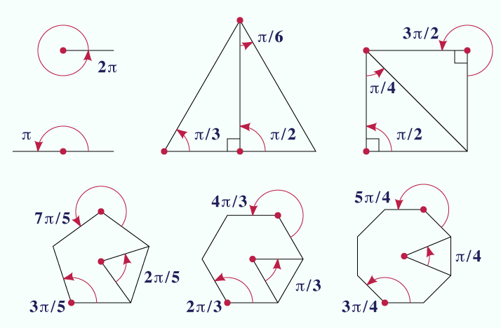
I've been moved to illustrate Radian. I have an elaborate animation in the works but...
Polygons[edit]
...meanwhile I thought of this:

I'd appreciate it checked for accuracy. Thank you. John Reid 16:50, 28 October 2006 (UTC)
- Yes, the labels are correct. The π/6 arc needs a larger radius to “read” clearly. The digits are noticeably bolder than the π they accompany. The solidus seems too wide; consider kerning or using “2π⁄5” style (<sup>2π</sup>⁄<sub>5</sub>, ⁄=U+2044). Consider using the same partition for the equilateral triangle and square as for the other regular polygons. Otherwise, it's visually clean. However, I would recommend using a gallery of separate images rather than one large composite. Among other benefits, it increases the possible uses. --KSmrqT 20:47, 4 November 2006 (UTC)
Thank you for your comments, KS. I considered some of the issues you raised. Let me discuss them and perhaps you'll be able to show me a way out.
I used the same "local unit" circle to create all the measure arcs. I agree that this makes the π/6 arc too short but I didn't want to violate this standard. The two instances of π/4 are a bit strained, too. If I could think of a good justification for using a "bigger" arc, I'd entertain the idea.
Using the same partition for the triangle aggravates the arc problem. The square could probably be as small as the higher-degree polygons but the space is there anyway. Also, the square and triangle indicate right angles and that symbol takes up some room. That can probably be managed; if you can see a way out of the arc "size" problem, I'd be open to all sorts of resizing.
I'm not too happy with the label text in general. I started with better-looking text but when the image is scaled, both line widths and text look crappy. (Check out the prior upload on the same image page.) So, I went back and bolded everything. The actual symbol for π is a huge problem. Most font designers don't bother to design it; they just steal it from another font. So, there isn't much choice in presentation and you don't usually get a bold symbol in a bold font. Some just look ugly. The white space around the virgule is a product of patching a fixed-up symbol over the weak font symbol. To tell the truth, I actually prefer a horizontal fraction bar but that shape may not fit well in the diagram.
I can fix the text better than this but I think, in the end, I'll have to demand a larger display in the article. There's just too much info here to squeeze down.
You'll need to talk more about a gallery of separate images. By putting all the figures in one image, I get to pack them in more closely; also, I needn't worry that they'll get munged when someone is editing text.
Mostly, I didn't want to throw too much work into the diagram until I had the angles checked. I use some of these constantly but others are obscure and, well, you never know when you've stubbed your toe until somebody points it out. Thank you. John Reid ° 12:34, 13 November 2006 (UTC)
Radians as unit circle arcs[edit]
- A second way of visualizing radian measure is that it is the length of a circumferential arc of a unit circle. That is, a central angle of 2π/3 corresponds to an arc of that length. Thus we can measure angles by measuring lengths. This is one reason why radians are so natural for mathematics purposes, while degrees are more awkward and artificial. (Compare to solid angles, which typically use steradians, corresponding to area on a unit sphere.) --KSmrqT 20:47, 4 November 2006 (UTC)
Not entirely sure what you mean. That is, I understand the concept but I'm not sure what kind of graphic you indicate. Can you sketch something?
Image:Radian cropped color.png is similar to the standard illustration of radians; I think it is obtuse, counterintuitive, and perpetuates an air of mystery. An angle of 1 radian is an irrational angle -- forgive me if the term seems misapplied. For that matter, it is not contructible. It is, essentially, a silly angle. I don't doubt that the diagram has its uses but it's not a good introduction. I say this with authority; my students often have trouble wrapping their brains around 1 radian but when I explain that a full circle is 2π, a line is π, a right angle π/2 and so forth, they light up. This presumes that they have a good grasp of π in the first place, of course.
Degrees are, of course, superstitious bumf. I have a clever little astrological chart made up that shows how primitive priest-astronomers stumbled on the fact that the sun goes around the earth in 360 days. Further refinements to the contrary, we are still stuck with this ancient measurement. (For that matter, perhaps we should be grateful. The nicely factorable 360 no doubt helped a lot of early geometers work stuff out; the error of 5.2425 helped to provoke all kinds of science and to dethrone mysticism.)
I took the easy way out by demonstrating the common polygon angles. I think this is the most useful explanation but it is not direct. Also, sooner or later one needs to hit 1 radian -- all the integer, irrational angles. I've started work on a ridiculously complex animation but I worry it's impractical.
Again, can you sketch something? Doesn't have to be beautiful or even accurate. I often work up clients' legal pad scribblings. John Reid ° 12:55, 13 November 2006 (UTC)
Radians in a table[edit]
- A third way to understand radians is to compare them to other angle measures. For this, a table would suffice, though a figure is conceivable.
cycle radian degree grad 1 rev 2π 360° 400 gon 1⁄2 rev π 180° 200 gon 1⁄4 rev π⁄2 90° 100 gon 1⁄6 rev π⁄3 60° 662⁄3 gon 1⁄8 rev π⁄4 45° 50 gon 1⁄10 rev π⁄5 36° 40 gon 1⁄12 rev π⁄6 30° 331⁄3 gon 1⁄16 rev π⁄8 22.5° 25 gon
I think the less said about gradians, the better. John Reid ° 12:56, 13 November 2006 (UTC)
Blank thumb in svg?[edit]
I tried replacing Image:Paley13.png with Image:Paley13.svg, and it looks ok on the image page and in my gallery. But when I try to use a thumb of it on an article page, with or without a pixel size, it just comes up blank; e.g. here. Is there something obvious I'm doing wrong? —David Eppstein 18:29, 4 November 2006 (UTC)
- Looks OK to me. --Salix alba (talk) 18:33, 4 November 2006 (UTC)
- To clarify, it's not white, it's 100% transparent at all pixels, both in my browser and when I drag the image to my desktop and open the resulting png in Photoshop. This is after reloading after seeing your "OK to me" comment, so it's not a temporary glitch that has mysteriously fixed itself. —David Eppstein 19:11, 4 November 2006 (UTC)
- I re-uploaded the image with a white background rectangle instead of leaving the background transparent. Now the thumb works fine but the page for the image itself shows nothing (or rather the checkerboard that indicates total transparency). Curiouser and curiouser. —David Eppstein 19:25, 4 November 2006 (UTC)
- It might be a cache problem the same image at 200px and 201px. The lhs is blank and the rhs shows what it should be. As the 201px size is new the thumb is recreated and this time it works correctly, while the 200px is already stored (incorectly). WP:PURGE might shed some light. --Salix alba (talk) 19:57, 4 November 2006 (UTC)

- Well the lhs was blank until I saved the page! --Salix alba (talk) 20:01, 4 November 2006 (UTC)
- It's still blank for me. There have definitely been some problems with image caching in the past week or so — seems like some of the cache servers aren't getting purged no matter what, and so keep serving old versions of images and thumbs. Hopefully the cache admins will soon figure out what causes it and get it fixed. —Ilmari Karonen (talk) 20:53, 4 November 2006 (UTC)
Thumb caching is a perennial issue. Both of these look good to me today. John Reid ° 12:10, 13 November 2006 (UTC)
- I did some purging of this page and the image page. It might have cured the problem, although it seems a black art to me at the moment. --Salix alba (talk) 13:41, 13 November 2006 (UTC)
(Much later...) I found some problems in my svgs that were contributing to this. One was that they were missing heights and widths, but I think that's not what was causing things to come out blank. The thing I changed that led to much better behavior was that the svg files I had been uploading defined and then used entities (that is, xml coding in the form of an ampersand, entity-name, and semicolon), mostly to avoid repeating the same style attributes over and over again. Expanding out all these entities fixed the problem. —David Eppstein 22:04, 4 February 2007 (UTC)
- The SVG renderer used here is deficient in numerous ways. Another example is that it does not seem to handle dashing. But it's fast! (As the old observation goes, if a program is not required to be complete and correct, it can be arbitrarily fast.) --KSmrqT 05:06, 5 February 2007 (UTC)
Torus animation[edit]
I thought I should ask here too. Comments may be needed on the torus animation by Kieff: Wikipedia:WikiProject Mathematics/Graphics/Torus. --Bernard 18:37, 12 March 2007 (UTC)
Greenspun illustration project: requests now open[edit]
Dear Wikimedians,
This is a (belated) announcement that requests are now being taken for illustrations to be created for the Philip Greenspun illustration project (PGIP).
The aim of the project is to create and improve illustrations on Wikimedia projects. You can help by identifying which important articles or concepts are missing illustrations (diagrams) that could make them a lot easier to understand. Requests should be made on this page: Philip_Greenspun_illustration_project/Requests
If there's a topic area you know a lot about or are involved with as a Wikiproject, why not conduct a review to see which illustrations are missing and needed for that topic? Existing content can be checked by using Mayflower to search Wikimedia Commons, or use the Free Image Search Tool to quickly check for images of a given topic in other-language projects.
The community suggestions will be used to shape the final list, which will be finalised to 50 specific requests for Round 1, due to start in January. People will be able to make suggestions for the duration of the project, not just in the lead-up to Round 1.
- General information about the project: m:Philip_Greenspun_illustration_project
- Potential illustrators and others interested in the project should join the mailing list: mail:greenspun-illustrations
thanks, pfctdayelise (talk) 13:12, 13 December 2007 (UTC) (Project coordinator)
BTW, this is the first wikiproject I've seen with a graphics subproject. Really cool. :) I have a soft spot for mathematics and I think there are some excellent proofs-by-picture possible, so I would be happy to see some suggestions from members of this wikiproject. thanks, pfctdayelise (talk) 13:16, 13 December 2007 (UTC)
Creating SVG graphics[edit]
I create all sorts of graphics for PDF documents using latex (mostly the epix and pstricks + add-ons packages), but I have no idea how to create an SVG instead of a DVI/PS/PDF file. I want to start adding images here at some point, but none of these formats are any good here. I've searched the net, and there are some (mostly commercial) conversion programs to convert each of those files to an SVG file, but the ones I tried tend to make a mess of the graphic (especially the fonts). There was a really good one, pdf2svg, but at $500+ for a license, I think I'll pass. So, long story short, is there any reliable way to have latex output to an SVG file? Or am I going about creating these graphics the wrong way? Ben (talk) 17:08, 8 February 2008 (UTC)
- I would like to know what software you recommend, too. I've looked inside a lot of the SVG images on Wikipedia and they all say "Inkscape". However, I'm not convinced artists aren't just using this program for post-processing (this is the only use I've found for it so far). SharkD (talk) 02:30, 18 August 2008 (UTC)
- By the way, Asymptote (vector graphics language) is another alternative to pstricks. Unfortunately, it suffers from the same limitation, as it does not natively support SVG as an export format. SharkD (talk) 02:34, 18 August 2008 (UTC)
- Inkscape is a perfectly good SVG editor, but its PDF/PS import ain't too hot. (It's basically using pstoedit internally.) The best (free) tool I've found for that is, surprisingly, the Scribus desktop publishing program, which can import PostScript and export SVG. Combine it with pdf2ps and Bob's your uncle. Of course, depending on what you're trying to convert, YMMV. —Ilmari Karonen (talk) 03:30, 18 August 2008 (UTC)
- I forgot about Scribus. However, I was looking more for software specifically designed for scientific/mathematics graphics. I just started testing gnuplot and haven't been very impressed with it so far. It's easy to use, but the aesthetic quality of the output is severely lacking. Of course, I haven't scratched too deep beneath the program's surface. There may be lots of graphic options I haven't encountered yet. SharkD (talk) 04:45, 18 August 2008 (UTC)
- Inkscape is a perfectly good SVG editor, but its PDF/PS import ain't too hot. (It's basically using pstoedit internally.) The best (free) tool I've found for that is, surprisingly, the Scribus desktop publishing program, which can import PostScript and export SVG. Combine it with pdf2ps and Bob's your uncle. Of course, depending on what you're trying to convert, YMMV. —Ilmari Karonen (talk) 03:30, 18 August 2008 (UTC)
GeoGebra for creation of SVG images[edit]
I would just like to mention that GeoGebra can be used to create geometric constructions and other plots and graphs in SVG. I noticed that some users use Inkscape, and wanted to point out that they may face less difficulty with this software. SharkD (talk) 00:16, 10 June 2008 (UTC)
Quadric[edit]
The images in Quadric will probably all need to be replace quite soon. They seem to be copyvios from [3] and are currently up for deletion on commons[4]. --Salix alba (talk) 13:15, 16 September 2008 (UTC)
torus with a tight place[edit]
If anyone would like to contribute a picture of a torus with a tight place (systole) for introduction to systolic geometry, I would appreciate it. Katzmik (talk) 13:20, 16 September 2008 (UTC)
- Thanks, very nice picture. However, it looks like the torus is pinched, and I was thinking of a torus with a tight, but still positive size, place, as well as perhaps a loop around it to show the "shortest loop" on the torus. Would it be too much trouble to produce an additional picture of this sort? Katzmik (talk) 08:51, 19 December 2008 (UTC)
- How's this? I don't really know any systolic geometry so I'm not sure what you are trying to show. If you want a loop that looks more like a path on the bigger torus I can do that, too. RobHar (talk) 18:39, 19 December 2008 (UTC)
- Thanks very much, that's terrific. If you have a few minutes, could you please design a more precise version of the figure at Elementary calculus? I would much appreciate it. Katzmik (talk) 09:15, 21 December 2008 (UTC)
- How's this? I don't really know any systolic geometry so I'm not sure what you are trying to show. If you want a loop that looks more like a path on the bigger torus I can do that, too. RobHar (talk) 18:39, 19 December 2008 (UTC)
Help needed for Mayer-Vietoris sequence article (ARCHIVE)[edit]
Ok, so here is my Christmas list. I would like a picture of:
- a 2-sphere composed of two overlapping hemispheres labeled A and B and their intersection, labeled , should be a thin band, i.e. a 'think circle'. Ideally the three "pieces" (the hemispheres and the bank) of the sphere have different colors with the labels consistently colored also.
- a torus composed of two overlapping tubes called A and B (half toruses) with the intersection appropriately labeled. On the torus there is a loop passing through both tubes. The loop is segmented as two paths (half loops), one lying wholly in A and the other lying wholly in B. The first path is labeled u, the second v, and the common endpoints labeled ∂u. EDIT: the same idea but with a 2-torus instead of a simple torus would be better. GeometryGirl (talk) 22:22, 15 December 2008 (UTC)

- Hey, I've given the 2-sphere graphic a try [5]. Mind you I've never done this before so it's probably not very good. I was unclear as to whether you wanted the pieces separated or not (I have separated them, but putting them back together would be very easy). Tell me what you think. I'll probably give the torus a try, too. Do you want the pieces separate? Cheers. RobHar (talk) 19:52, 15 December 2008 (UTC)
- That's great but I would like them not separated. To see the overlapping I think it would be nice to have the pieces semi-transparent (not fully opaque). GeometryGirl (talk) 20:28, 15 December 2008 (UTC)
- Ok, I've got another candidate for the sphere [6]. I find it hard to show the intersection. Hopefully this works. RobHar (talk) 06:18, 16 December 2008 (UTC)
- This is very much what I wanted (at least the idea of it). If you find better graphical solutions the better, but for now I'll put it on the article. Great job RobHar! GeometryGirl (talk) 08:05, 16 December 2008 (UTC)
- Ok, I've got another candidate for the sphere [6]. I find it hard to show the intersection. Hopefully this works. RobHar (talk) 06:18, 16 December 2008 (UTC)
Converting to computer graphic[edit]
-
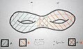 Illustration of the boundary map ∂* on the 2-torus where the 1-cycle x = u + v is the sum of two 1-chains whose boundary lies in the intersection of A and B.
 -
The Klein bottle (fundamental polygon with appropriate edge identifications) decomposed as two Möbius strips A (in red) and B (in green).
-
 This decomposition of the suspension X of the 0-spheres Y yields all the homology groups of X.

These pics remain to be converted to computer graphics:GeometryGirl (talk) All done! RobHar (talk) 00:07, 23 December 2008 (UTC)
- Double-torus done (see [7]). I'll work on the other two soon. RobHar (talk) 23:26, 18 December 2008 (UTC)
- Suspension of the 0-sphere done (see here). The svg version is messed up, anyone know why (I made it in inkscape and saved it as Plain svg). RobHar (talk) 20:56, 19 December 2008 (UTC)
Nearly all five pictures done! I have a few ideas to improve the suspension of the 0-sphere. Instead of having X in plain black, we could show X as the union of A and B with overlapping colors (similarly to A intersect B), and add this in the labeling. Also, could you change the color of A to blue, and the color of B to red so that everything stays consistent (and have the labels colored as well)? Finally, I find the labeling too condensed below, so I propose to put the names of the objects (Y, X = A∪B, A, B, and A∩B) above the pictures, and the descriptions (S^0, SY = S^1, ~pt, ~pt, ~Y = S^0) below. What do you think? (BTW, some problems with SVG graphics are discussed above) GeometryGirl (talk) 23:42, 19 December 2008 (UTC)

- When making the new version I tried out drawing X as A union B, but I found it made the meaning less clear. Specifically, I felt that X should be displayed on its own before being displayed as a union, just to make it clear what space was being dealt with. I thought of adding another X drawn as A union B but I feared that would be overkill. What do you think? RobHar (talk) 19:00, 21 December 2008 (UTC)
Yes, I think it is overkill, the image is already quite long.GeometryGirl (talk) 10:28, 1 January 2009 (UTC)
RobHar, I often have problems with text in SVGs (probably because don't understand much about Inkscape and SVG). My solution is to convert all the text to curves: select the text (ungroup if necessary) and do "Object to Path" in the "Path" menu. The disadvantage is of course that you can no longer edit the text. -- Jitse Niesen (talk) 14:35, 21 December 2008 (UTC)
- Klein bottle done a while ago. DMacks (talk) 04:15, 11 October 2011 (UTC)
- ??? RobHar (talk) 05:42, 11 October 2011 (UTC)
- This section begins with a request to make improved diagrams for some hand-drawn ones. the middle one of the three up there is a Klein bottle. A high-quality diagram equivalent exists (actually has for a while)--I am stating that fact and linking to the apparent replacement (I see links for some of the hand-drawn images but not that one). I don't know the workflow here regarding handled requests, but the low-quality image is still up there and is now up for deletion (because it's low quality and has a high-quality alternative available). I'm giving a direct link here to the new image so that anyone looking here (the only place that the old image is still in use) can verify that there is indeed a replacement available. Feel free to click on the old image and join in its deletion discussion. I have no idea the thoughts about WPMath regarding keeping superseded images (Is there value to the hand-drawn one? Should the others similarly be deleted as obsolete?) DMacks (talk) 08:19, 11 October 2011 (UTC)
- ??? RobHar (talk) 05:42, 11 October 2011 (UTC)
Matrices and linear maps of R2[edit]
Can somebody help me out with some illustrations for Matrix (mathematics)? I realize that what I want is fairly easy, but last week I got really angry with Inkscape, so perhaps somebody more apt could help...
For the matrix article, I'm thinking of an array of illustrations showing how 2-by-2 matrices can be seen as linear transformations of R^2. The types of matrices should be some of the ones given here. It would be good if the matrices would be numerically easy (perhaps just integer entries where possible), so that we can mention the matrix in the image caption or so. I like the layout of File:Rotation illustration2.svg, but that's not so important. Thanks a lot, Jakob.scholbach (talk) 17:09, 31 December 2008 (UTC)
- I also have another idea: to visualize a stochastic matrix, say
- I could think of an animated image showing several dozens little balls starting off in three "boxes" and changing their location at every interval as per the given probabilities. The animation should be sufficiently long so that one sees the absorbing state of the Markov chain. Again, thanks for any help. Jakob.scholbach (talk) 18:09, 31 December 2008 (UTC)

- I've done four of them, tell me what you think. I've saved them in inkscape format so they should be easily editable as well. I made the transformed shapes slightly transparent. To make these I setup the original shape, brought what I wanted to be the origin to the point (0,0) of the image, then I went to "Transform" and used the "Matrix" option. After all was done, I simply had inkscape automatically resize the image to fit the drawing. RobHar (talk) 20:27, 31 December 2008 (UTC)
- Thank you! I think, the grid could perhaps be somewhat less dense? At least in the thumbnail view, it is a bit blurred, right? Jakob.scholbach (talk) 15:41, 1 January 2009 (UTC)
- Yeah I think you're right. I made the grid thicker on all of them. I also changed the parameters on two of them to make the pictures less big. Take a look at the gallery below and tell me what you think. I've also made the updates at Matrix_(mathematics)#Linear_transformations. Cheers. RobHar (talk) 22:32, 2 January 2009 (UTC)
-
 Vertical shear with m=1.25
 -
 Squeeze mapping with r=1.5
 -
 Scaling by a factor of 1.5
 -
 Rotation by π/6


![[2]](https://commons.wikimedia.org/wiki/Image:UnstabilityHS.svg)
![[5]](https://commons.wikimedia.org/wiki/File:SphereParts.png)
![[6]](https://commons.wikimedia.org/wiki/File:SphereCover.png)
![[7]](https://commons.wikimedia.org/wiki/File:DoubleTorusCover.png)
Cool, I like that better. Thanks again. I will try to get involved with animated gifs and so on... Jakob.scholbach (talk) 11:21, 3 January 2009 (UTC)
Help with SVG animation[edit]
Hi, Jakob recommended that I ask you for help with figures. I'm trying to bring the Euclidean algorithm to Featured Article; the text is nearly ready but more images would be helpful. I've made a series of 13 color SVG images illustrating how the EA finds the greatest common divisor of 1071 and 462; they can be found here. I'd like to stitch these SVG images together into an SVG animation, that is, without making it into a GIF animation, which sacrifices resolution. Could someone here do that, or tell me how to do that on Wikipedia? Thanks! Proteins (talk) 05:40, 18 April 2009 (UTC)
- Not knowing that animated SVG was possible a had a look around and found it is and there are some on commons commons:Category:Animated SVG. However none of these seem to work in my browser (firefox). Apparently they get converted to a png before rendering so animation won't work. A gif animation will be a fair solution as being a solid colour image it should resize fine. Animated PNG is another option. --Salix (talk): 09:11, 18 April 2009 (UTC)
Thanks for the tips. I've uploaded a GIF animation here; how does it look? I'd appreciate your suggestions. Proteins (talk) 12:29, 18 April 2009 (UTC)
- It looks good to me. A couple of picky points. There is a small problem with frames 5 onwards - the second blue square is slightly higher than it should be, also the red squares have a slightly too wide a border on the rhs. Also wondering if some different numbers could be chosen so that the red squares are not quite so small.--Salix (talk): 15:28, 18 April 2009 (UTC)

Image request for the function article[edit]
Please see Talk:Function_(mathematics)#black_box_.2F_machine_image_needed. This would be a simple project for someone with image skills, but my attempts to make images are never successful. — Carl (CBM · talk) 12:48, 3 May 2009 (UTC)
Font used in formulas, in images[edit]
I was wondering if we should aim to use a similar font as the LaTeX output in images that reproduce formulas from the body of the article. For instance, most of the images in HSL and HSV#Formal_derivation that use a Sans Serif font. It's kind of hard to identify in the images what is a formula, and what are merely labels. Using a Latin font might help to distinguish between the two types. Thanks. SharkD Talk 06:16, 24 June 2010 (UTC)
Image request for standard part function article[edit]
There is currently a hand-drawn figure at standard part function. It would be desirable to replace it by a finer drawing if possible. Tkuvho (talk) 16:55, 4 November 2012 (UTC)
Animated Graphic for Johnson's Circles, and animated SVG's in general[edit]
I was looking at the article for Johnson's Circles. The graphic there is fine, but a little cluttered to take in all at once. I had the idea that an animated reveal would make the graphic communicate better. I have uploaded a modified version of the graphic which slowly reveals the components in the order they are mentioned in the caption. The animated version of the graphic can be found here: http://commons.wikimedia.org/wiki/File:Johnsons_Theorem_animated.svg I have tested it alone in Safari, Chrome, and Firefox. I found I had to make the initial state all visibile, otherwise it showed up as blank in the wikimedia file view. Also, when I test-edited it into the Wikipedia page, the preview wouldn't animate unless I clicked to bring it up alone. The modifications to add the reveal animation were pretty simple, and animated svg's seem so superior to an image sequence. Rather than modify the Johnson's Circles page, I thought I would mention it here to see if this seems like a good idea or not, or if there are any suggestions. Dsmccoy (talk) 00:58, 3 December 2012 (UTC)
- If you look at SVG animation you'll see that the wikipedia software automatically generates static, non-animated thumbnails of SVG images. The best you can do is provide a link to the actual svg like [9].
- Personally I'm not a big fan of animations. An alternative would be to show a series of static images.--Salix (talk): 01:47, 3 December 2012 (UTC)
![[9]](https://upload.wikimedia.org/wikipedia/commons/6/66/Johnsons_Theorem_animated.svg)
chain rule[edit]
Hi. There is an animation of chain rule. It has no good description and it's value is unclear/ doubtful. Can you check it ? Should it be removed or described ? TIA--Adam majewski (talk) 08:13, 8 April 2020 (UTC)
